OPTIMAZATION OF the Velder WEBSHOP
Redesign Search Result Page
Timeline
5 months
My Role
Intern UX/UI Designer
Redesign for the Search Result Page.
Research Findings
The Problem
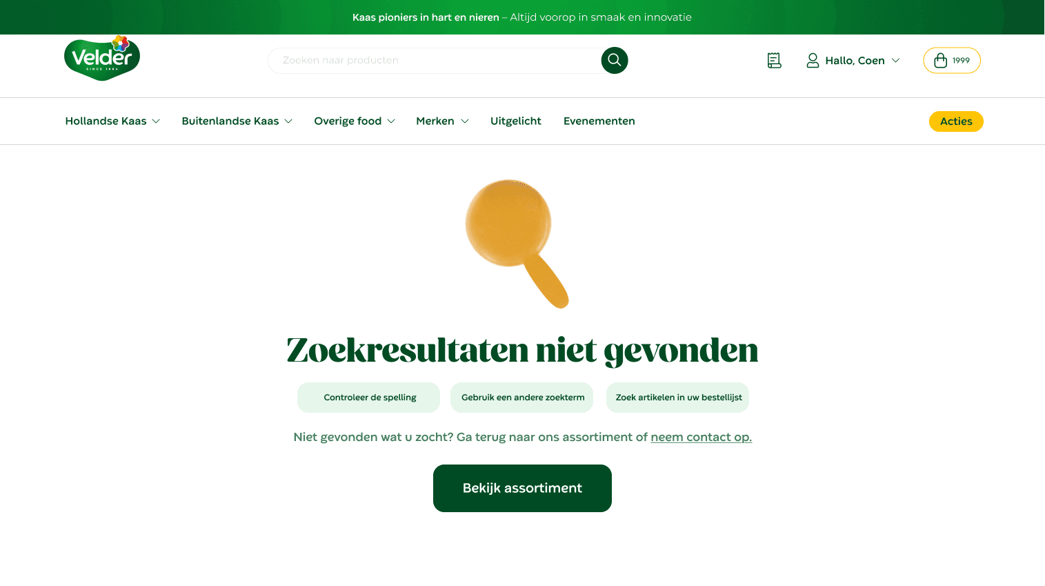
The Search Results page no longer aligned visually with the redesigned 404 page, creating a disjointed user experience. Additionally, customers were unsure what steps to take if they couldn’t find their product, making the search process less efficient.
The Solution
A compact, optimized Search Results page maintains visual consistency with the 404 page while keeping functionality clear. Guidance is added for users who cannot immediately find what they are looking for, ensuring they know the next steps.
Design Process
Providing actionable guidance on “what to do next” reduces frustration and supports task completion.
Source: Feedback Valerie
Users were confused when search results did not match the visual style of other pages.
Source: B2B Customers Velder Webshop
A streamlined design improves readability and overall user confidence in navigating the site.
Source: Feedback Valerie
Step 1
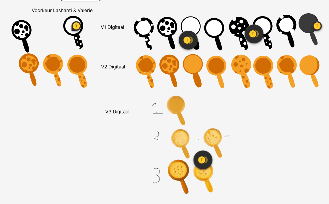
Logo
On the 404 page, the original design featured a cheese wheel rolling in as the 0 in 404. I wanted to put my own twist on this idea, so I created a cheese search magnifying glass logo. Here are some of the iterations I designed.
Step 2
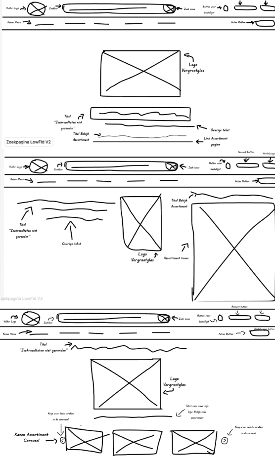
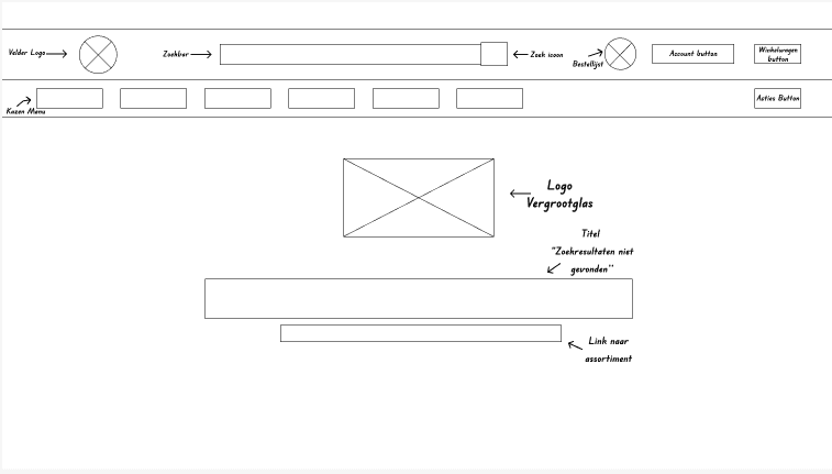
Low Fidelity Wireframe
Simple layout to visualize where the elements should be placed on the screen. I created three versions and gathered feedback from the digital team on each.
Step 2
Mid Fidelity Wireframe
Refined layout with improved hierarchy and spacing, incorporating feedback from the low fid stage and ensuring visual consistency by aligning the layout with the 404 page.
Step 3
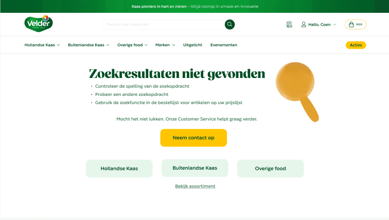
High Fidelity Wireframe
Finalized design with visual details and interactive elements.
Results

Key Features
Consistent Layout
Matches the style and visual hierarchy of the 404 page for a cohesive user experience.
Clear Search Feedback
Shows users what to do if their search results don’t show up.
Prioritized Information
Highlights the most relevant options first.
Visual Cues
Includes icons or small graphics (like the cheese-looking-glass) to make the page more engaging.